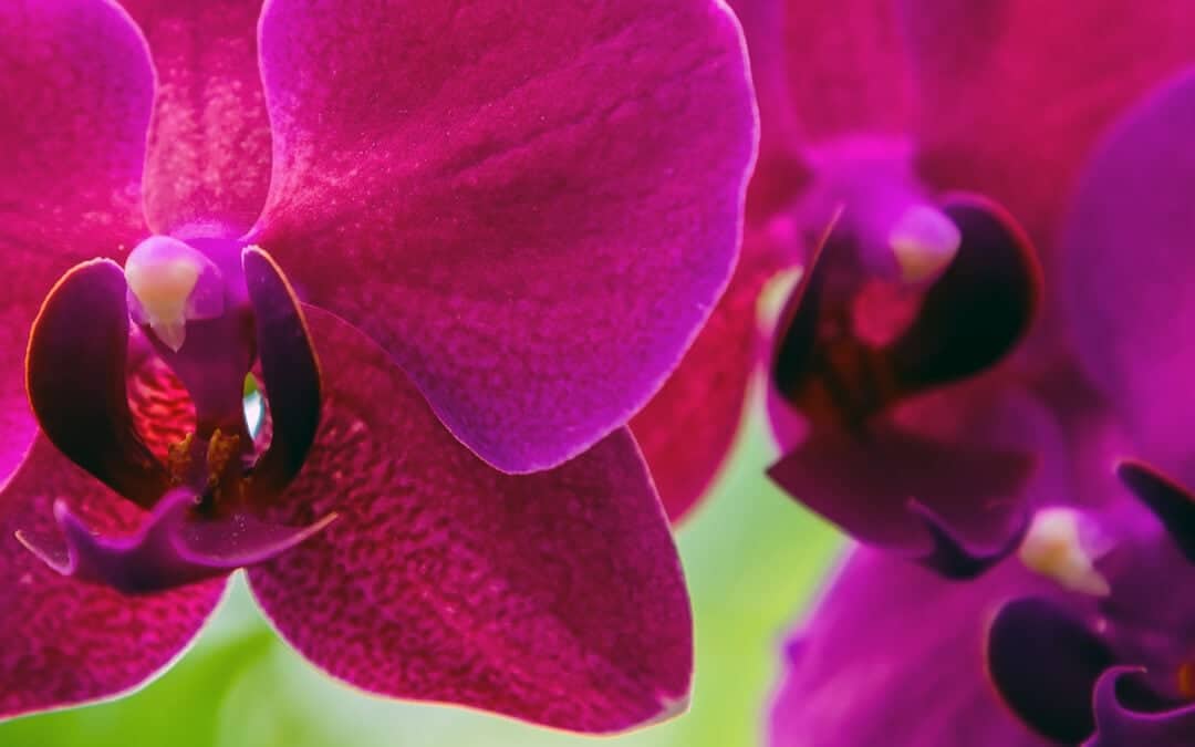
Magenta is a colour that exudes positivity and we have to admit, this colour was perfectly chosen to look to the future with optimism after the difficult times that have passed. This color is modern and fresh, but at the same time magenta is also luxurious and graceful, especially in combination with golden highlights and noble fabric selection in the interior design.
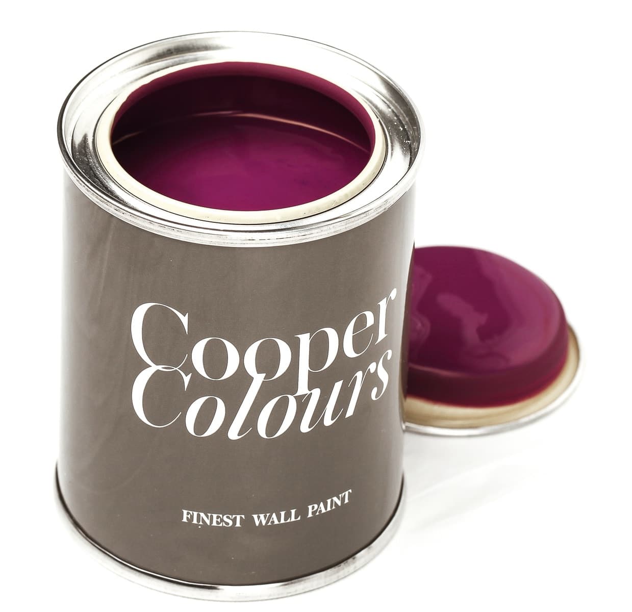
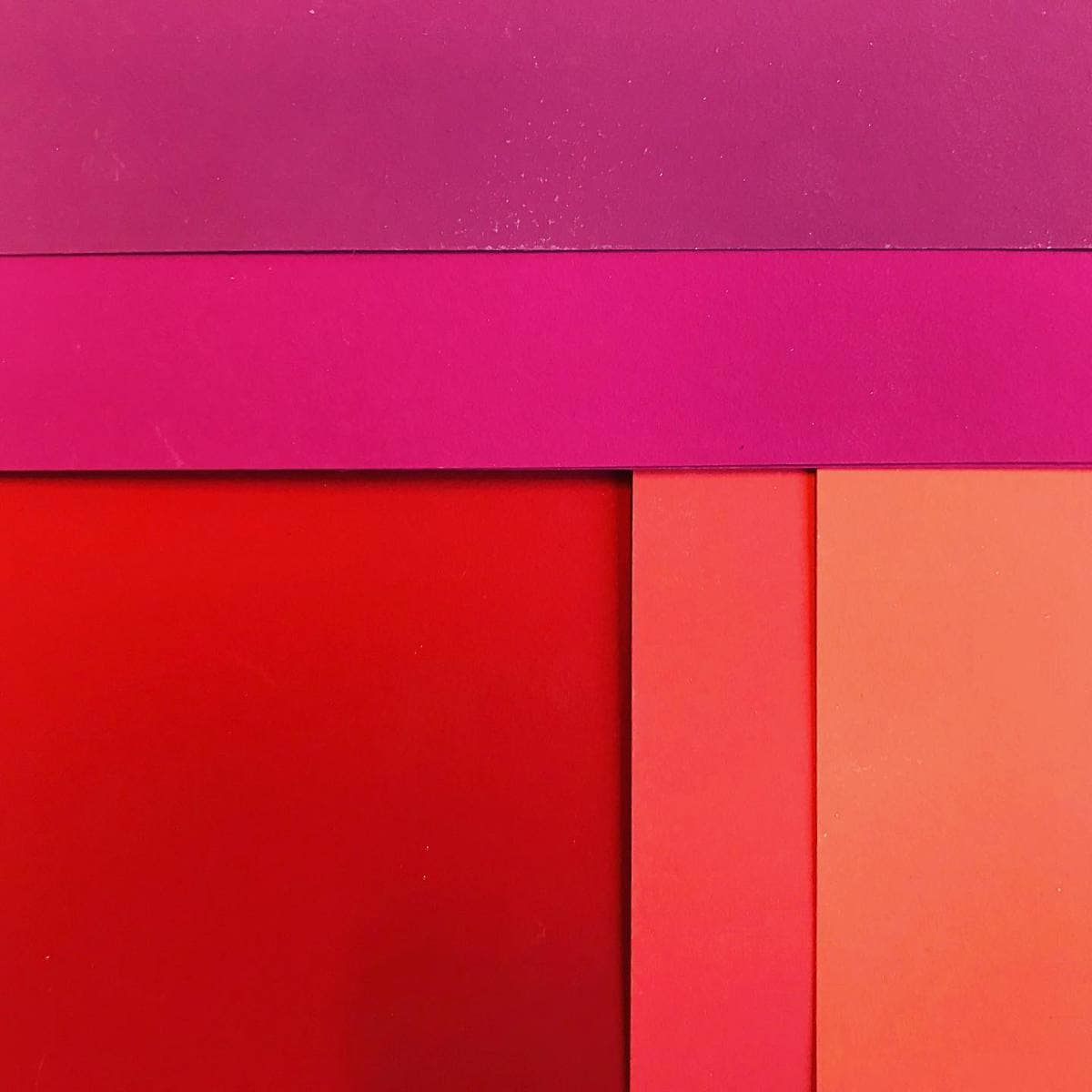
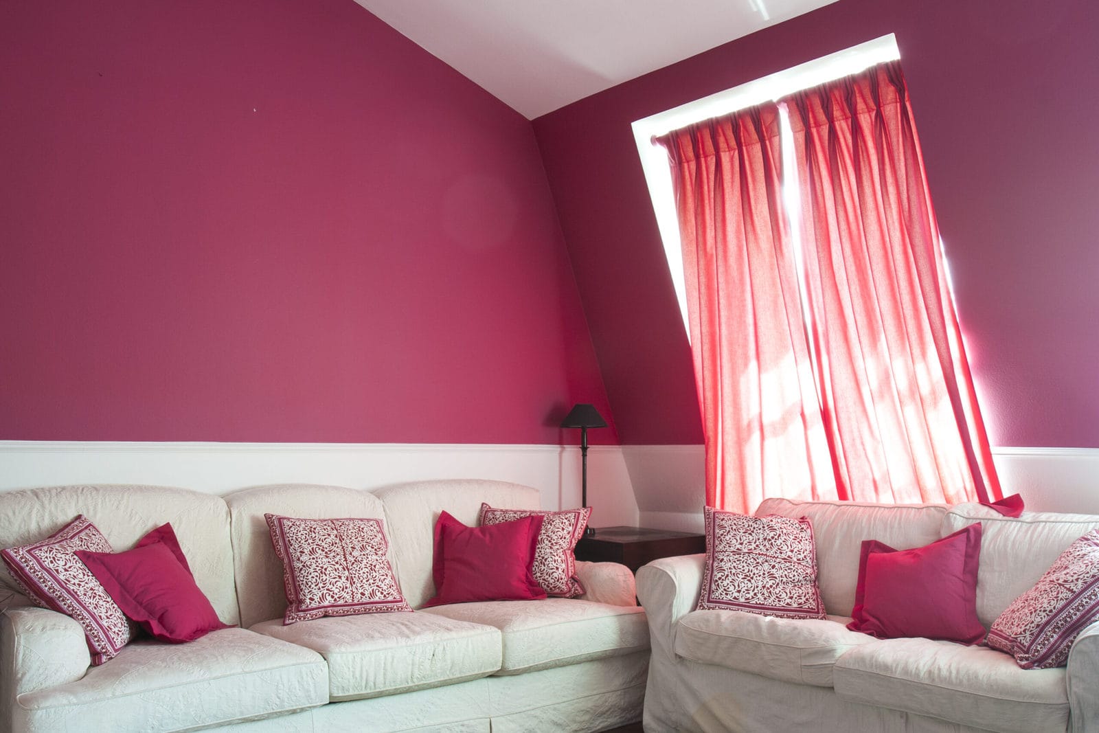
In short, the new Orchid Flower color trend makes you want something new and exciting, and what better way to do that than to redesign your own four walls. Our magenta shades are perfect for an eye-catcher in the new study or combined with our light beige and taupe shades as an accent wall in the living room. A real highlight when entering a room.
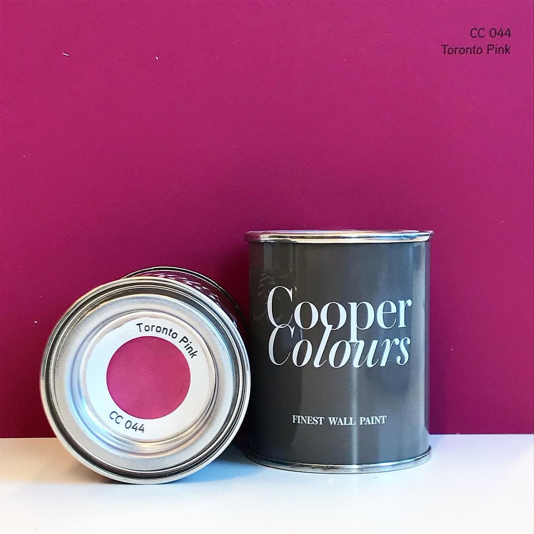
our CC 044 Toronto Pink matches the color trend
But in addition to the trend colour Orchid Flower, there are four other colours that have been selected by WGSN and Coloro as important colors for the new year.
Olive Oil
Unlike the other colours selected, Olive Oil was chosen for its calm and balanced appearance. Due to its natural affiliation, Olive Oil is mainly seen outdoors, but we can also imagine this shade being perfect in bathrooms or bedrooms. In our Cooper Colours color palette we have several colors based on Olive Oil, such as our Valencia Olive, our Saint George Military or our Honolulu Palm from our pastel palette.
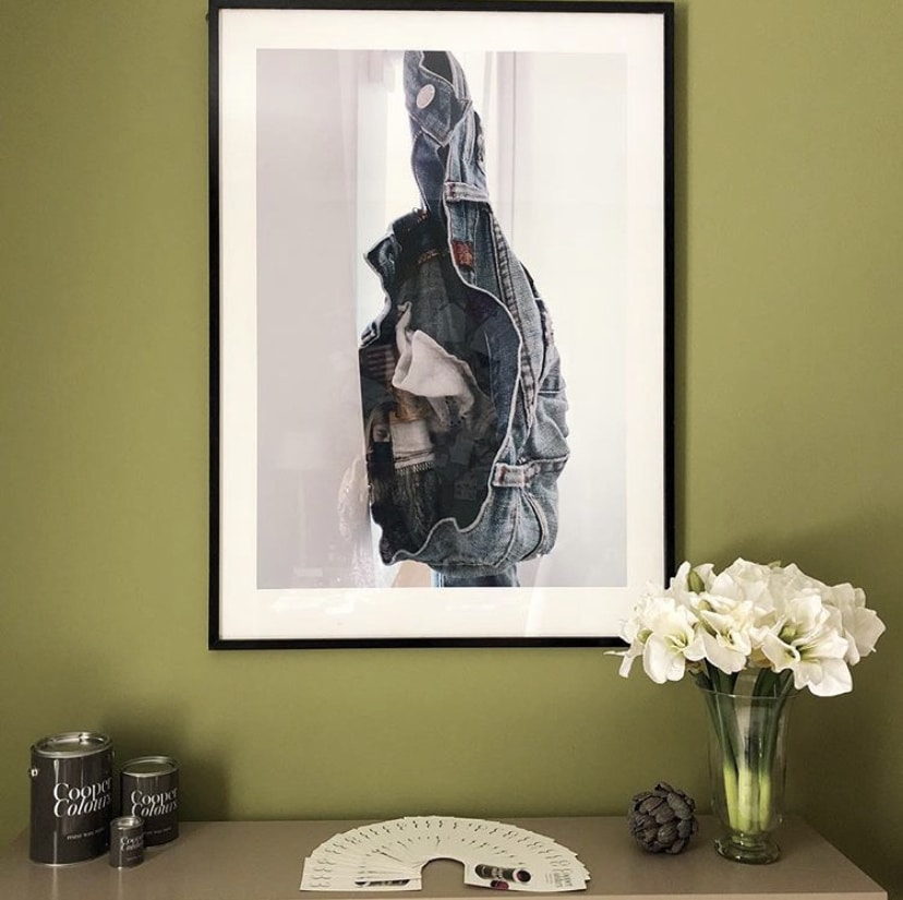
here our CC 095 Saint George Military comes into its own
In contrast to the bright yellow tones, some of which have become real trendsetters in recent years, the color butter, as the name suggests, is a delicate, soft pastel yellow. It is an extremely warm and soft shade, but is also neutral enough not to be overpowering. Our Malaga Cheese, Sydney Sun, San Miguel Sand or our Damascus Sand are our recommendations. It is suitable for both large and small rooms and, in combination with white ceilings, makes the room look nice and bright.
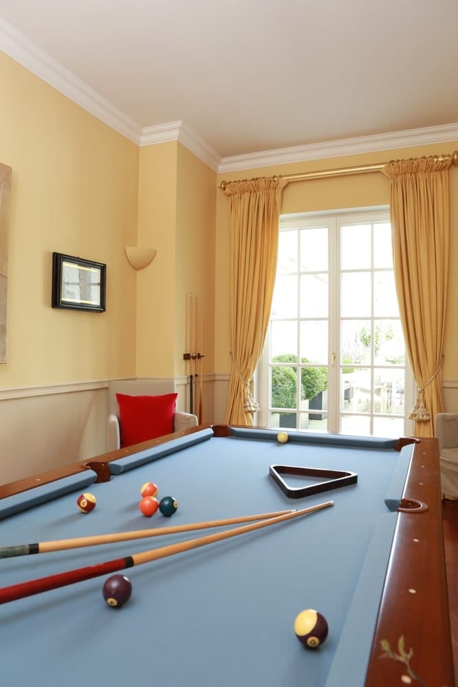
Our CC 032 Sydney Sun instantly brings warmth to any room
This bright yolk yellow has a refreshing and invigorating effect. We can also imagine this tone very well in combination with a strip painting technique. This colour will instantly brighten up any room. Algiers Saffron is the perfect shade from our Cooper Colors palette.
Shades of blue always play a huge role in trend research, so it’s no surprise that a shade of blue is featured this time too. Atlantic Blue is a deep, luxurious and intense blue. Our Inverness Blue has all these qualities and has historically been a popular shade for bathrooms, bedrooms and other spaces.
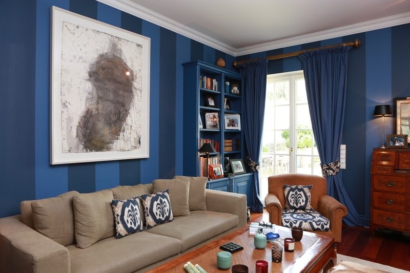
a real eye-catcher is our CC 078 Inverness Blue combined with our CC 079 Berlin Night

